Sublime — how do you digitize human discretion?
A luxury invitation-only travel platform for ultra-high-net-worth members across the Middle East, taken from discovery research to live production, across web and mobile simultaneously.
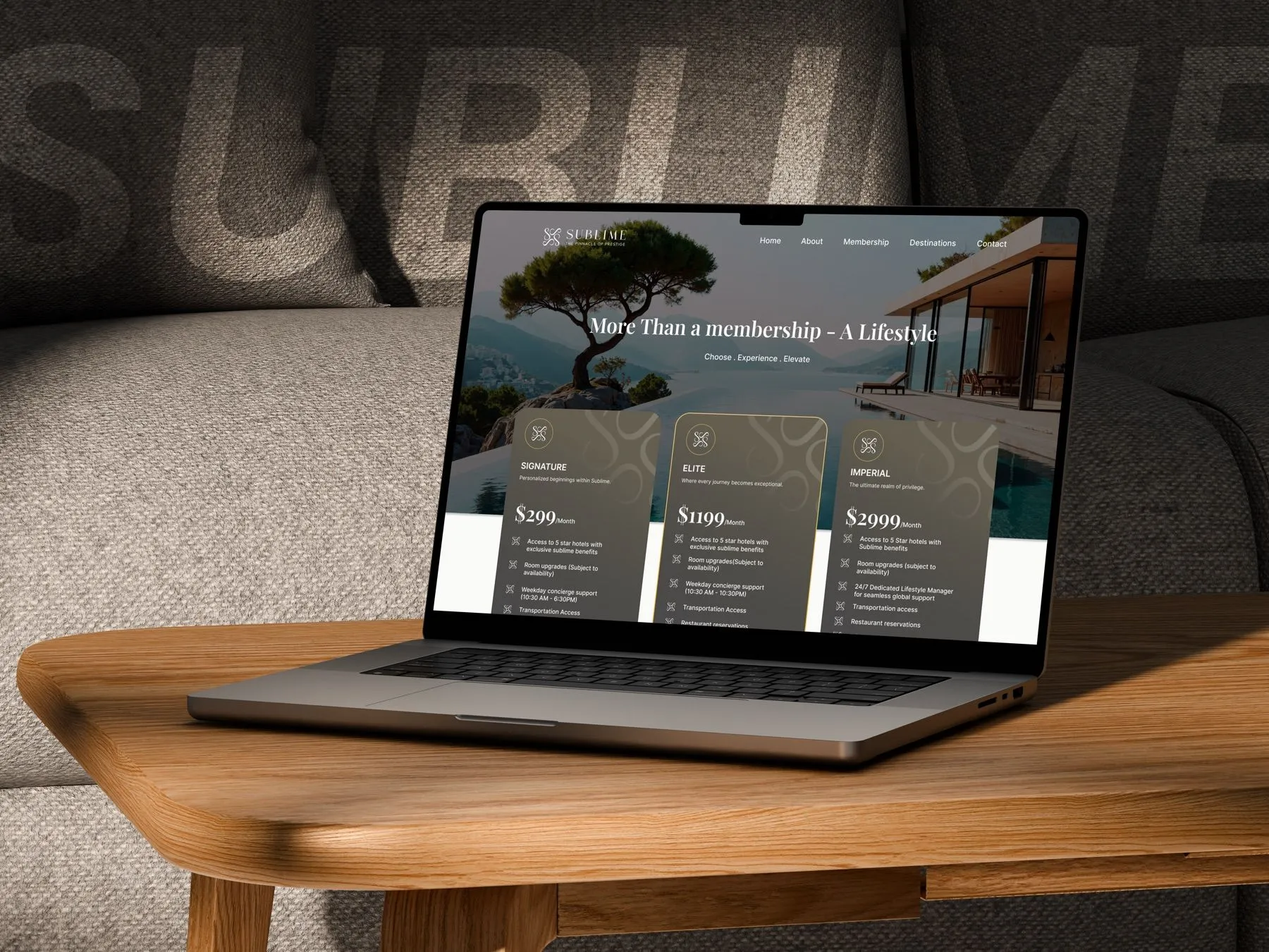
Where technology meets trust
The luxury travel landscape is saturated with platforms focused on availability, not authenticity. Sublime fills the gap between mass luxury booking websites and personal concierge services.
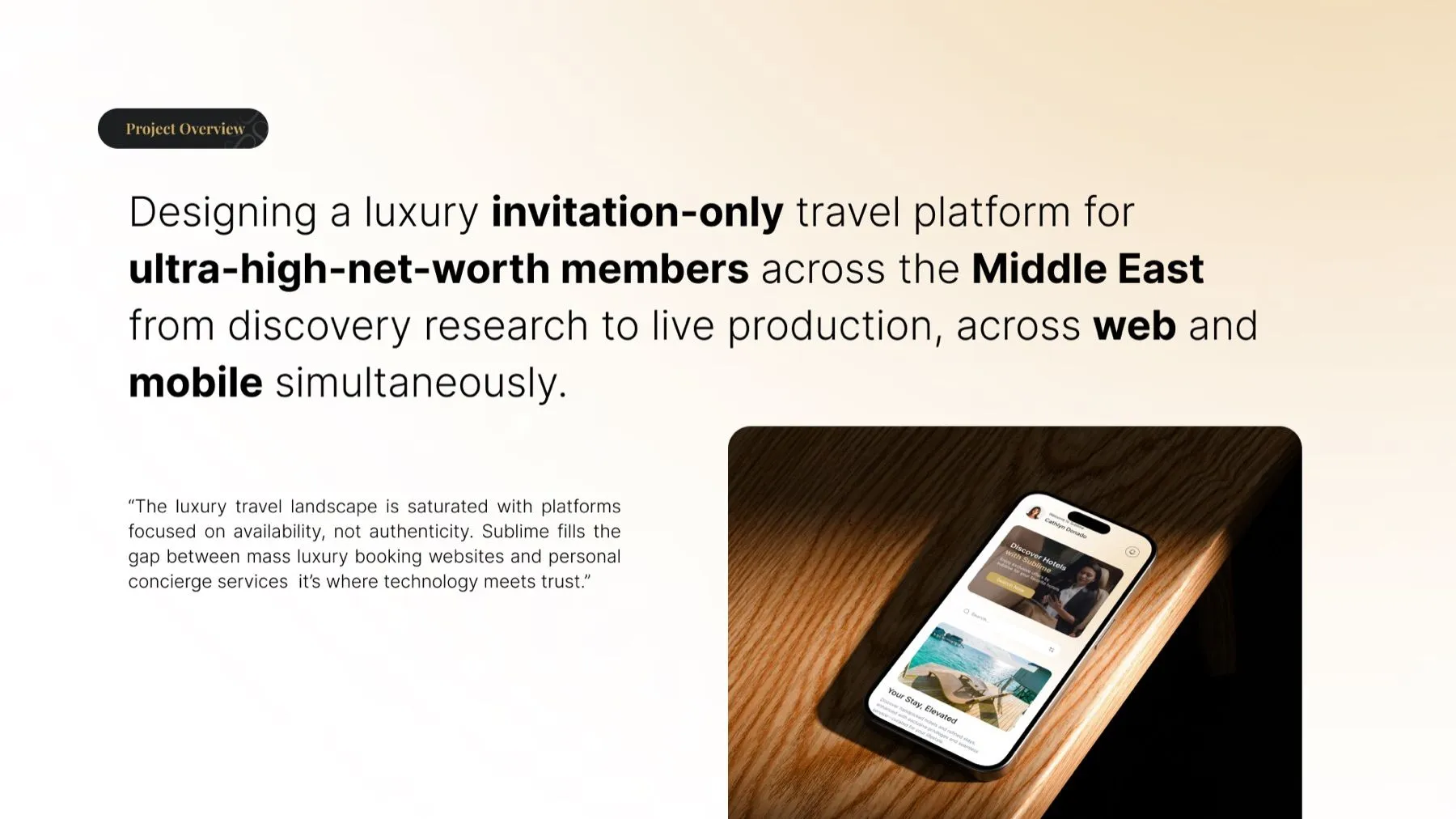
Frictions and solutions
Six core friction points came out of the research on the client's test site. Three of them decided the shape of the product.
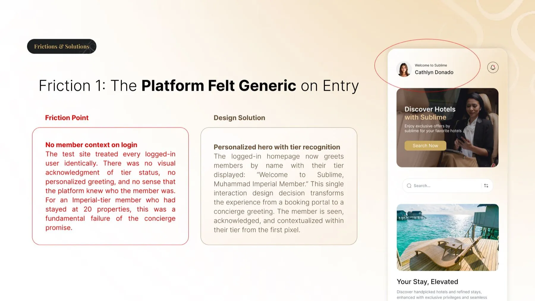
The platform felt generic on entry
The friction. The test site treated every logged-in user identically. No visual acknowledgment of tier status, no personalised greeting, no sense that the platform knew who the member was. For an Imperial-tier member who had stayed at 20 properties, this was a fundamental failure of the concierge promise.
The solution. A personalised hero with tier recognition. The logged-in homepage greets members by name with their tier displayed. That single interaction design decision turns the experience from a booking portal into a concierge greeting.
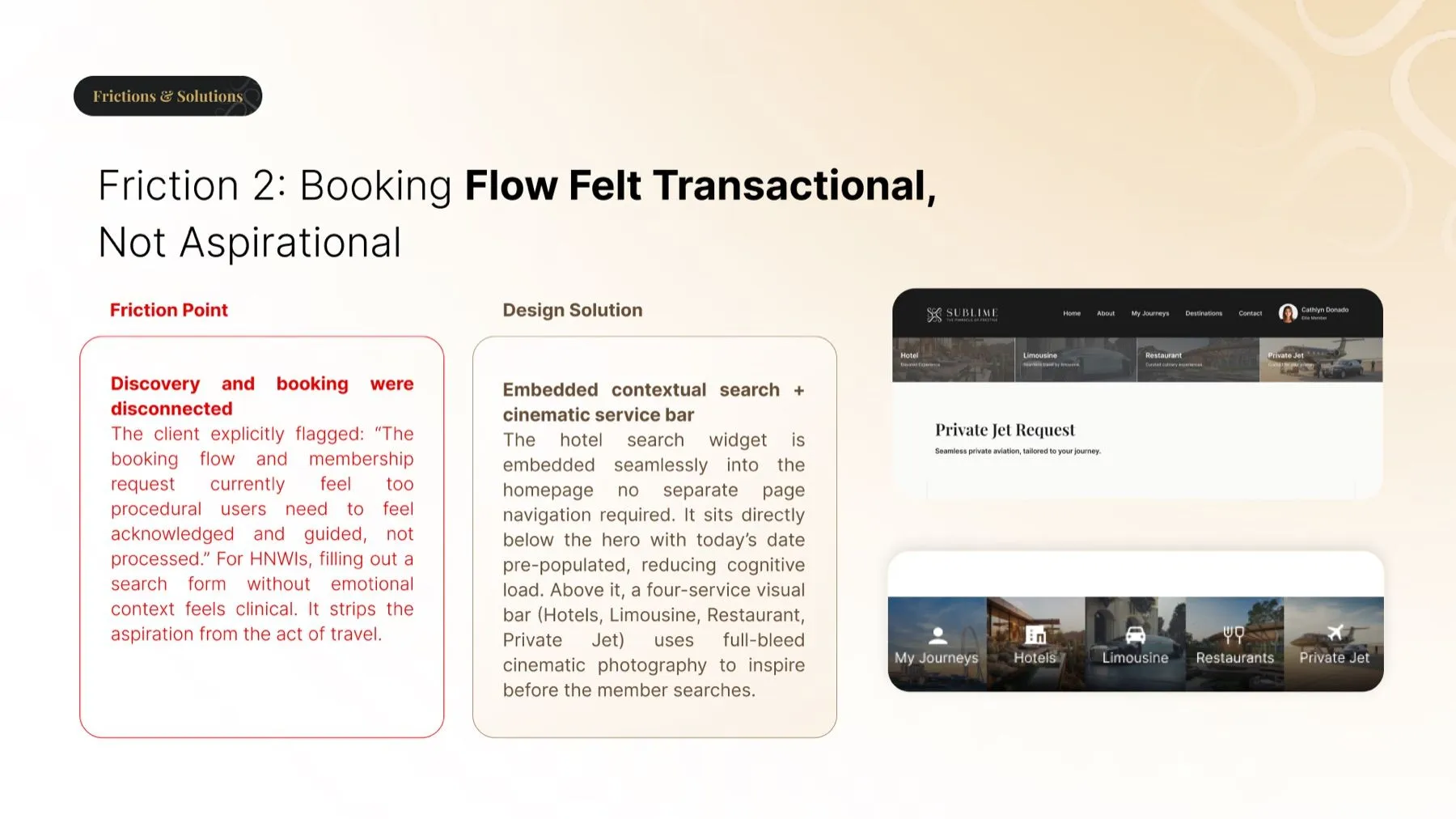
Booking flow felt transactional, not aspirational
The friction. The client flagged it directly: the booking flow and membership request felt too procedural. Users need to feel acknowledged and guided, not processed. For these members, filling out a search form without emotional context is clinical. It strips the aspiration from the act of travel.
The solution. Embedded contextual search and a cinematic service bar. The hotel search widget sits directly below the hero with today's date pre-populated, no separate page navigation. Above it, a four-service bar covering hotels, limousine, restaurant and private jet uses full-bleed photography to inspire before the member searches.
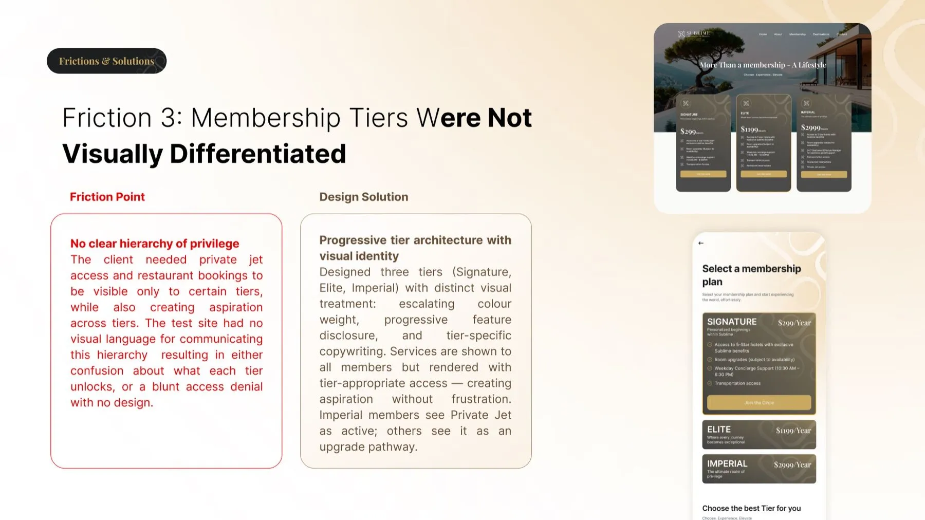
Membership tiers were not visually differentiated
The friction. Private jet access and restaurant bookings had to be visible only to certain tiers while still creating aspiration across them. The test site had no visual language for that hierarchy, which left either confusion about what each tier unlocks or a blunt access denial with no design.
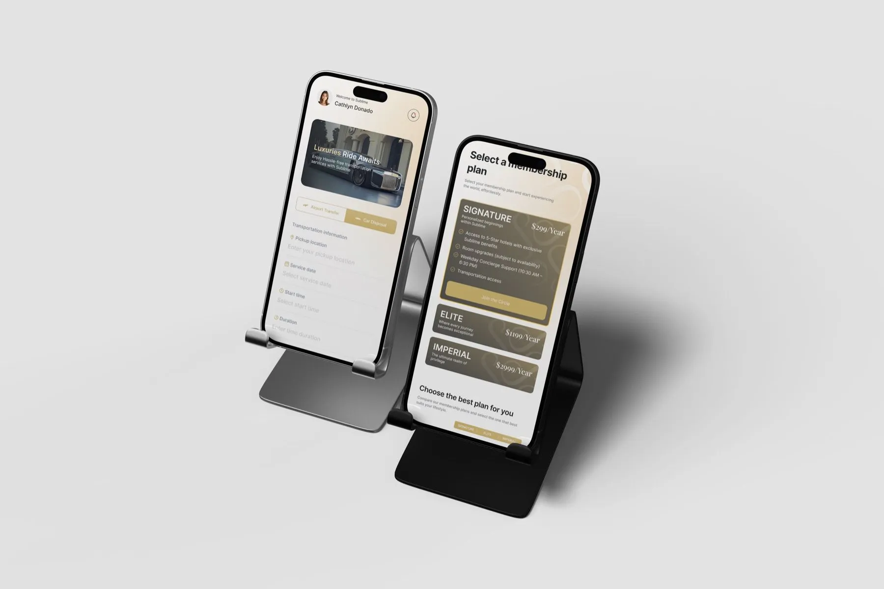
The solution. Progressive tier architecture with its own visual identity. Three tiers, Signature, Elite and Imperial, with escalating colour weight, progressive feature disclosure and tier-specific copy. Services show to every member but render with tier-appropriate access, which creates aspiration without frustration. Imperial members see Private Jet as active; others see it as an upgrade path.
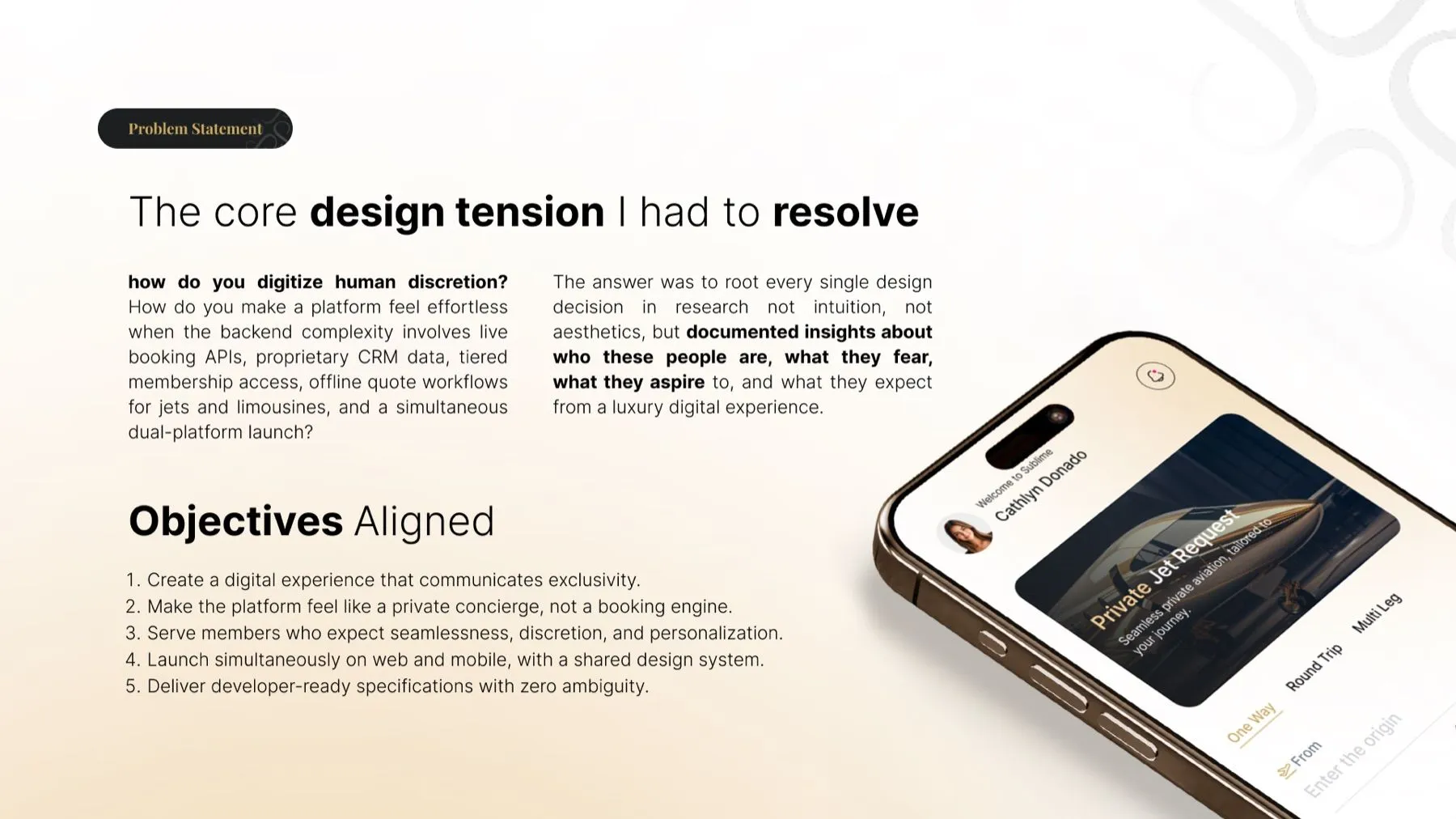
The core design tension I had to resolve
How do you make a platform feel effortless when the backend complexity involves live booking APIs, proprietary CRM data, tiered membership access, offline quote workflows for jets and limousines, and a simultaneous dual-platform launch?
The answer
Root every single design decision in research. Not intuition, not aesthetics, but documented insights about who these people are, what they fear, what they aspire to, and what they expect from a luxury digital experience.
Why it mattered
Discretion is a human quality. Encoding it into software means deciding, screen by screen, what the system should already know about a member and what it should never make them ask for twice.
Objectives aligned
Communicate exclusivity
Create a digital experience that communicates exclusivity.
Concierge, not booking engine
Make the platform feel like a private concierge, not a booking engine.
Seamlessness and discretion
Serve members who expect seamlessness, discretion and personalization.
One system, two platforms
Launch simultaneously on web and mobile, with a shared design system.
Zero ambiguity in handoff
Deliver developer-ready specifications with zero ambiguity.
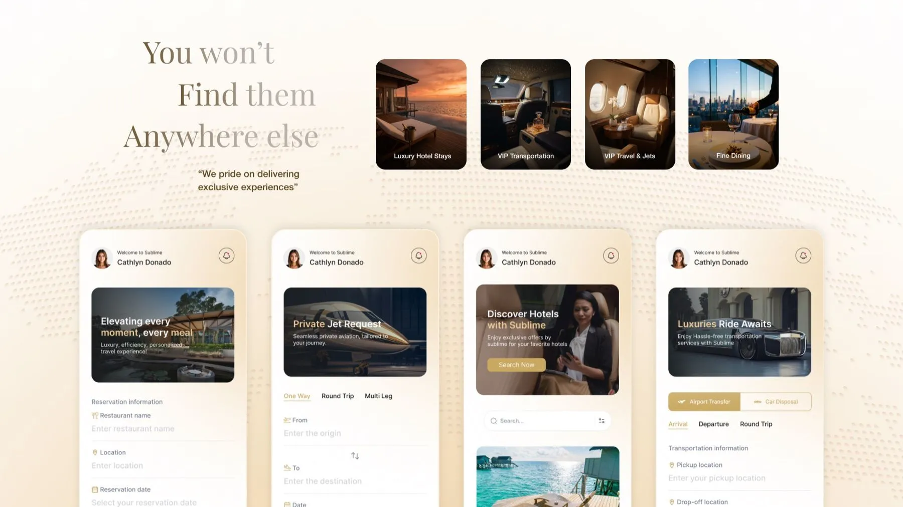
Four services, three tiers, two platforms
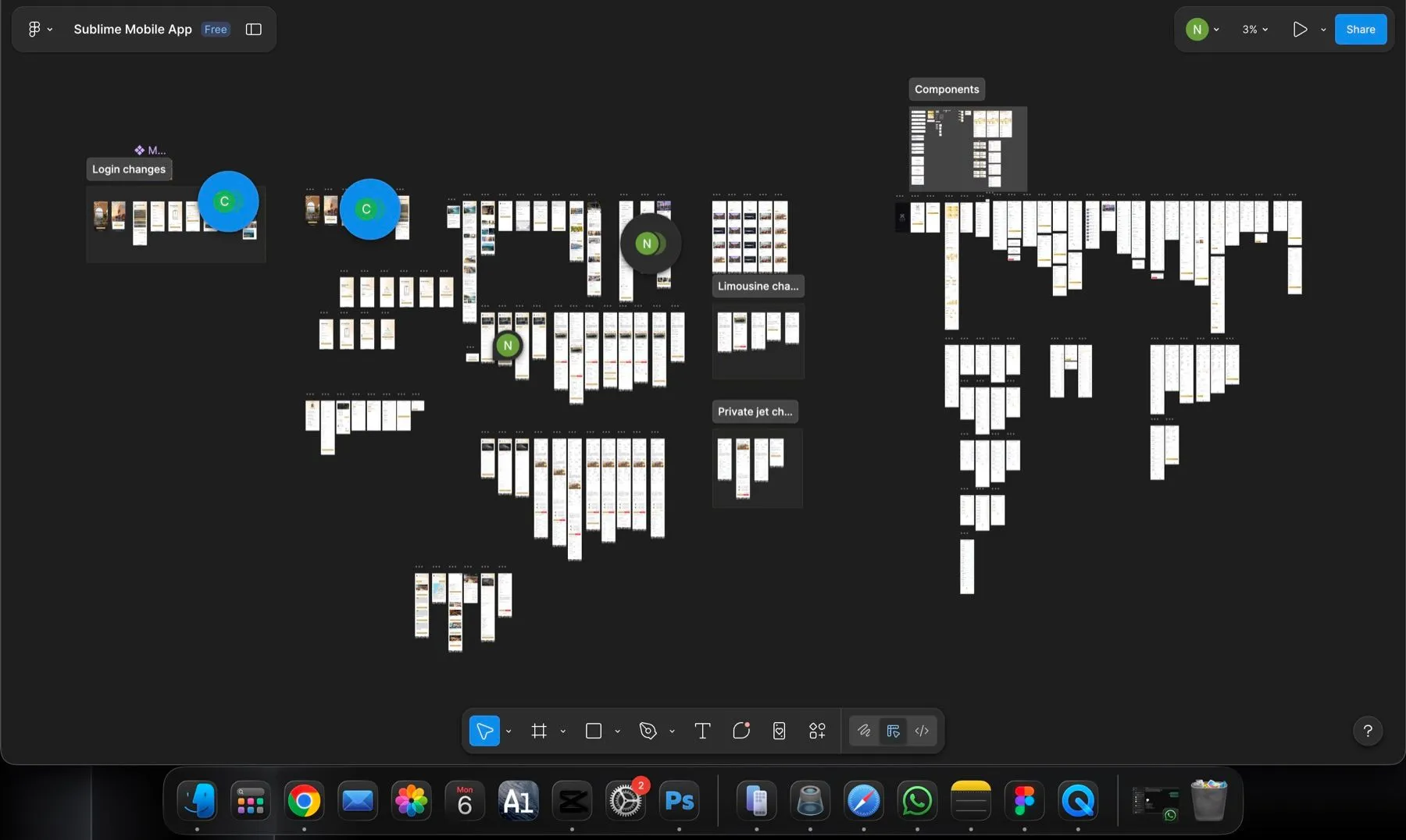
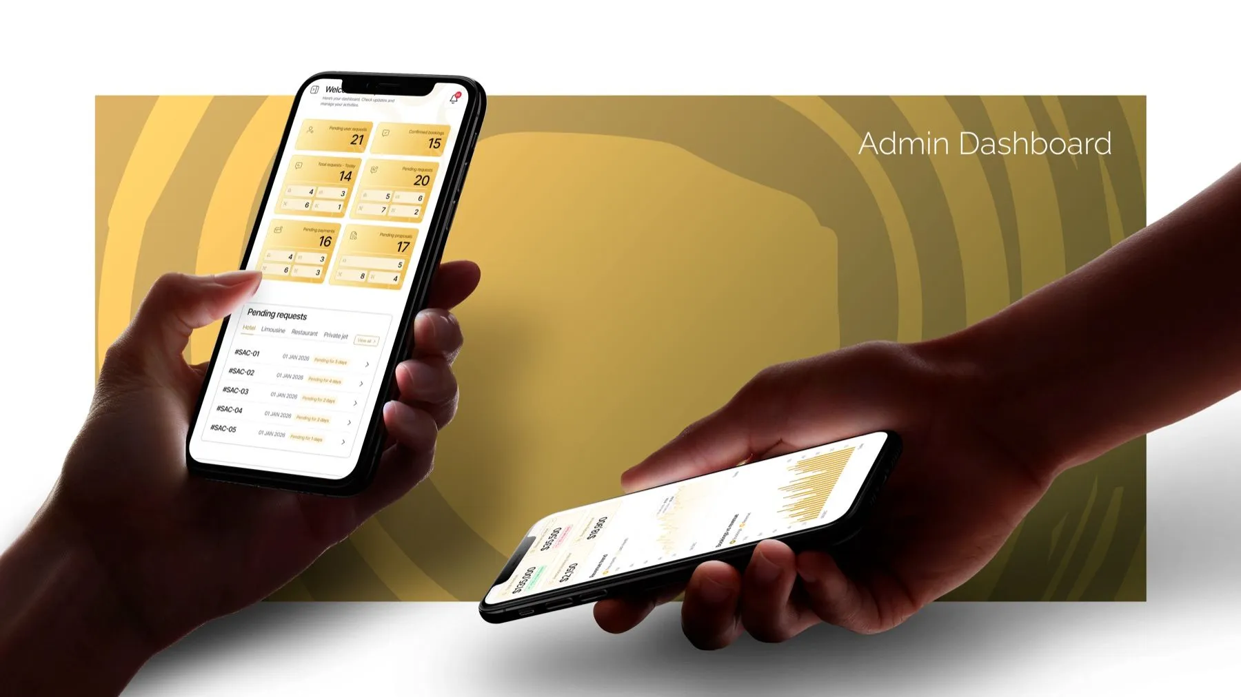
Luxury hotel stays, VIP transportation, VIP travel and jets, and fine dining. Each with complete UX flows and developer specifications, rendered consistently on web and mobile.
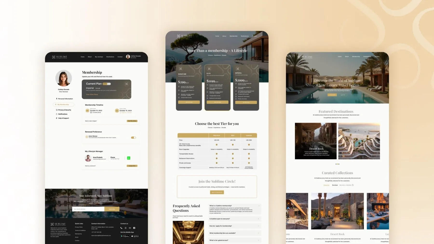
A lifestyle manager, in the product
Every member has a named lifestyle manager reachable from inside the account, with direct phone and messaging. It is the point where the software stops and the person takes over, designed rather than bolted on.
Offline workflows, same flow
Jet and limousine requests run as offline quote workflows behind an interface that looks identical to the instant, API-connected paths. The member never learns which is which.
Outcomes and impact
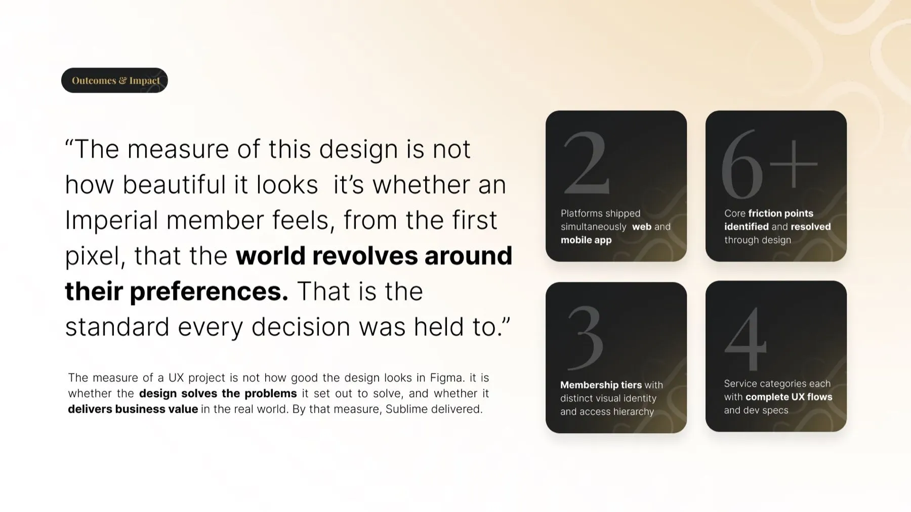
The measure of a UX project is not how good the design looks in Figma. It is whether the design solves the problems it set out to solve, and whether it delivers business value in the real world.
"The measure of this design is not how beautiful it looks. It is whether an Imperial member feels, from the first pixel, that the world revolves around their preferences. That is the standard every decision was held to."
Got a product that has to feel personal at scale?
That is a research problem before it is a design problem. Tell us who your users are.